I was at the Seattle Tech Meetup recently, where five local companies or product extensions were presented. In a couple of cases it was hard to understand the actual product from the pitch, so I went and checked the websites later. I decided to take look out how well these startups did in terms of capturing in a single page what their presenters were trying to convey in 6 minutes of talking.
Here is how I think about the primary goals of the homepage:
Quickly convey the core value proposition (15 second rule) to a prospective customer
- Target audience: Am I in the right place? Is this product for CEOs or plumbers?
- Problem being solved: Are they trying to solve a problem I have?
- Class of product/service: Is this a SAAS product, a dating service, an accounting program?
- Key features: What can I do with this product, will it meet my needs?
- (Pricing): I put pricing in parentheses, as not all companies want to disclose pricing before customers start to engage. I think those cases should be rare, (because I can’t imagine signing up for a trial without any idea of what a service costs), so each startup should test this.
Get potential customers to engage
- Create a clear Call To Action for customers to engage: It should be clear what is going to happen when customers hit the button.
- Build trust and reduce anxiety: The classic template for this for startups now seems to be a combination of citing press mentions, showing existing customer logos, and/or testimonials from users. Free trials and cancellable subscriptions also serve to reduce anxiety.
Provide access and support to existing customers (I won’t touch on that in this context.)
How did they do?
Relaborate

Above the fold is a large graphic that doesn’t add any information. It doesn’t give me any sense of who the audience is or what setting this might be used in, which are often goals of graphics on the homepage. Picture the doctor in the clinical setting (for a medical product) or a family in front of the TV for Netflix, etc.; nor does it show me features of the product. “Rethink Collaboration” lets me know that this product has something to do with collaboration. “Relaborate encourages, organizes and activates the ideas and insights from your workforce, creating a culture of innovation and collaboration.” – These are great goals, you have piqued my curiosity, but I need some specifics please. Below the fold, there is a series of feature highlights. Unfortunately, the screen shots aren’t big enough to see what is going on. I am still unclear who this product is for and how it works. Parsing through the text, there is a lot of stuff about “content” and “content management system”, so I am guessing that this is targeted at people who are trying to produce some kind of content, like blogs or a magazine or something, or maybe a TV news show; as opposed to say nuclear scientists collaborating on an international experiment. In the end, I still don’t know who this product is for or how it really works or what specific problems it solves.
“Try Relaborate for Free.” The call to action is above the fold, but I know nothing about the product yet, and it is overwhelmed by the higher contrast larger “button” above it telling me to rethink collaboration. Is this different from the “Get Started” call to action in the upper right? If I get started will it also be free?
For the trust building testimonials, there are two areas for improvement here. First these are people no one knows. Second if you read them closely, these people are “playing” with the product. They haven’t applied it yet or seen results. The best testimonial is on the page after you click Try Relaborate. The press logos don’t actually say “as seen in”, and none of them are hyperlinked, so for me this hurts trust rather than builds it.
Haiku Deck
 It’s immediately clear that this is presentation software, and the image and iOS AppStore logo make it clear that this is mobile centric. I am less clear on the fanciful/aspirational “set your story free” part. I don’t necessarily think of presentations as “stories,” but in the most generic sense I guess they are. Business managers don’t typically think about it that way, so I am thinking this is more for writers/artists than business people presenting a report or a new product plan. I’m over-analyzing this, but perhaps enlightening the reader that all presentations are “stories” is part of the goal. Reading the small text helps me understand the breadth of the target audience, which is great. My thinking is that the last line should be the headline: “Haiku Deck makes presentations simple, beautiful, and fun.” The play button on the video gets muddled by the text on the iPad, and it is not clear whether there is an actionable video, or whether that is part of the interface for the product. I really like the step by step explanation of how to use the product, though I am not sure the icons are helpful. If you take away the text, do the icons convey the meaning? If you claim to make beautiful presentations, the pressure is on to show that you know beautiful design, and these icons just clutter this page. So in short, I get the value proposition (audience, product type, features, problem to be solved, pricing), but I would pump up the fact that it is FREE!
Building trust is accomplished with the standard press mentions, which are actually linked to more detail on a page. They are greyed out on the page, which makes them look inactive. But the press quotes are great, so I would lose the icons mentioned above and use the space to put in pieces of the press quotes.
That leaves the call to action. If you are looking at this page on an iPad, you can actually download the app. It’s worth a test, and I might pump up the call to action a little, create some excitement.
Attendible
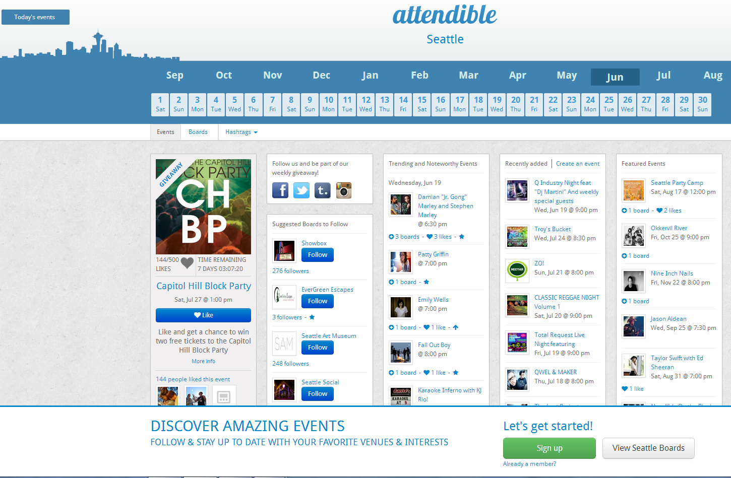
The value proposition is made really clear by the two lines of text at the bottom of the page. “Discover amazing events.” “Follow and stay up to date with your favorite venues & interests.” It tells me what problem it solves and calls out the key features. But why is that text at the bottom of the page!? I like the Seattle skyline graphic (hey you know my city, and you have put some effort into my city), but that calendar graphic, yikes! I it is not the way we are used to seeing calendars and the month doesn’t tie well visually to the dates. Why does it start with Sept, and why is June (the current month) way off to the right. Is it Sept 2012 or 2013? I like that I can actually see the product interface on the home page, but I would pump up the headers of the columns. So I get the value proposition. The call to action “Let’s get started”, makes it sound like I have a bunch of work ahead. How about something like, “Find great events” or “Personalize your event boards”. There are no trust builders, but I assume it is free, and I am getting value just from the homepage, so I don’t need someone’s testimonial to tell me that it helps them find events.
GeekWork from GeekWire
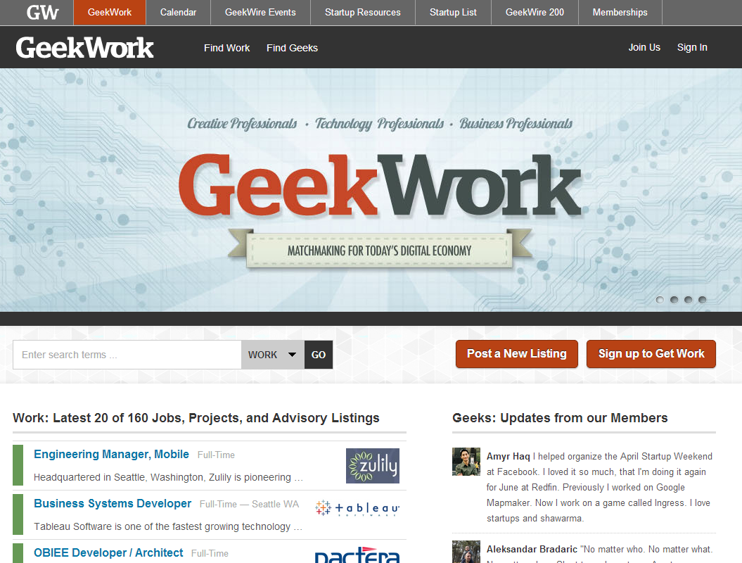
I am not a big fan of sliders, because you either end up waiting for the them to scroll through, and then you have to go find the one that caught your eye, or you have to be active and click through them. That said the target audience and value prop are really clear. It is clear that it is a matchmaking service for employers and employees. What kind of employees? Technology professionals, creative professionals, business professionals. I immediately know what type of a service this is, and who the target audience is, what problem this is solving. I can see some of the interface on the home page (the job listings), and I always like that. I added a second image to show another component of the sliders widget. What I like about this is that they have encompassed a shot of the UX in the graphic, showing the user how easy it is going to be to highlight your skills, and educating prospective employers how precisely they will be able to target skill sets.

Pricing? No data, but I assume it is free for posters and costs money for employers. Call to action? I like the clear “Post a Listing” and “Sign Up to Get Work”, but there is also a vague “Join Us” in the upper right. And the search box? Is that so I can look at jobs without signing up? Since GeekWire is already a trusted blog, it doesn’t need much in the way of trust builders, and since employers are desperate for tech talent and good knowledge workers, they’ll try anything…
TinyPulse

So this is a classic trick to engage the user, the surprise headline. I think it is fairly effective in this context. The last text block tells me what this product does and the expected benefits. The reference to “ leader” and “your team”, suggest that I might be able to implement this just for my work group if I am a group manager. (Part of the democratization of IT). The testimonials are all from CEOs though, and while they are good trust builders, they make me wonder whether this is a product that is targeted at corporate wide adoption, implemented by Central Services. As you scroll down below the fold (not shown) there are key attributes called out, like “easy” and “insightful,” accompanied by screenshots and descriptions of features. These are great in helping me understand details of what the product does, but the screenshots need to be bigger. Also, you don’t need to show me that the screenshot is on a computer. I get that. Just make the screenshot bigger, so I can read it. Call to action? Clear 14 day free trial signup, no credit card required. That’s great, and good to know that no cc is needed, but 14 days seems a pretty short time frame to engage, especially since you told me right up front that change takes “dedication and patience.” If I were king, I might test 14 days without a cc, then get another 30 days if you put your credit card into the system. Trust building testimonials are great. There is a list of companies there, which I assume are customers, but it doesn’t actually say so. And after seeing so many press listings looking exactly like this, at first I glossed over them thinking they were press mentions. Make it clear they represent just a handful of the many satisfied customers.
Generally this is really good. I am a little puzzled by the name TINYpulse though. What is with TINY in all caps? And “tiny” speaks to insignificant, not critically important. You are positioning this product as critical to the organization, not insignificant. I have to assume that all the names that were more descriptive were taken, but I would still lose the TINY. Better to go with “EASYpulse”, or at least capitalize the part that is important. tinyPULSE. Flower logo? How about heads to show this is about people management? My two cents…
And if you own one of these sites, and you don’t like my comments, see my post on “How to Take the Feedback.” :-p
